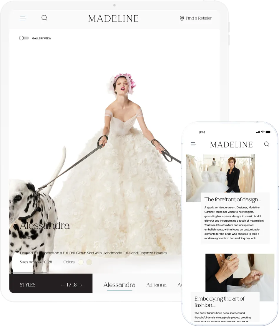
Madeline Gardner, the head designer for wedding dresses at Morilee, decided to launch her own brand with a vision to offer high-quality wedding dresses with a touch of New York sophistication. As part of the brand strategy, Madeline wanted to create a visually stunning website that effectively showcases her collections and brand story, while also providing a unique user experience.
Designing and developing a WordPress website for Madeline Couture, a new, high-end wedding dress brand.
Designing and developing a WordPress website for Madeline Couture, a new, high-end wedding dress brand.
CLIENT
MADELINE COUTURE
DISCIPLINES USED
- UX/UI Design
- Micro-animations
- WordPress Development
- Guttenberg Block Development
PROJECT
Designing and developing a WordPress website for Madeline Couture, a new, high-end wedding dress brand.
THE BACKGROUND
THE CHALLENGES
The primary challenge for CXR was to create a website that would reflect the elegance of the brand’s wedding dresses and photography assets while simultaneously offering a user experience unlike any other in the bridal space. Additionally, since approximately 70% of the site traffic would be through phone and tablet, the novel design concept would have to be fully mobile optimized.
SOLUTION
Madeline was executed in two distinct phases, each targeting specific goals. In Phase 1, the team designed a dynamic and engaging landing page featuring an email signup form, utilizing parallax scrolling over a single, high-quality image to add depth and movement, capturing the user's attention and guiding them to the signup form. Phase 2 was centered around showcasing Madeline's initial product line, photographed by renowned fashion photographer Walter Chin, and conveying the brand's story. The design team's focus was on the Product Listing Page, a primary touchpoint on the website, where they developed two horizontal sliders at the bottom of the page. This design allowed users to easily explore all of Madeline's products via horizontal scrolling or by selecting a specific product to view its images, creating a unique and immersive product browsing experience.

FEATURE / PROCESS
Parallax Scrolling
Parallax scrolling effect on the homepage of the website served as a pivotal feature in augmenting the modern and aesthetically appealing design. By introducing this design element, the homepage was rendered more visually captivating and, in turn, elevated the overall user experience by imbuing it with interactivity and memorability.Dual Horizontal Slider
The product listing page operates two concurrent horizontal sliders, allowing the user to see all products via horizontal scroll or view the images for whichever product is currently selected. The Product Listing Page also offers the user the ability to switch to a gallery view, where all the dresses can be viewed in the standard vertical view.Product Videos
On the Product Listing Page, if the product assets include a video, that video will begin to play on hover, providing a unique display of the product.Google Analytics Setup
Google Analytics was set up on the page to optimize it and track user interactions.Klaviyo Integration
The sign-up form has been integrated with Klaviyo for collecting leads.
Now Let’s See
What We Can Do For You
Get started today. Or if you want to get to know us a little better, that’s cool too. Click here to learn more
