Designing for Mobile Sites

As technology becomes more advanced and smartphones become more accessible, we’re beginning to see an exponential increase in mobile users. Nowadays, up to 70% of web traffic comes from mobile phones and we don’t expect it to slow down anytime soon.
For this reason, it’s become necessary for designers and developers to tailor user experiences and designs to mobile users. From considering the role of touch and space to building responsively for mobile, the following are the 4 ways designers and developers are reinventing web design for mobile.
As we mentioned before, mobile screens are a lot smaller than desktop screens. Naturally, this means that designers must pick and choose which elements are absolutely necessary to a brand’s message – and which elements are most likely to catch the eye of a potential customer.
Minimize cognitive load
Cognitive load is the amount of brain power that is required in order to use something – in this case, a website or application on mobile. Minimizing this load also minimizes user confusion and limits their feeling overwhelmed. When a user feels overwhelmed or confused, they are more likely to abandon the task.
Declutter
Think about how clutter looks on desktop. Now, think about that same clutter on mobile. According to Adobe, cutting out clutter is one of the major do’s of mobile design – and for good reason. Like an increased cognitive load, clutter can confuse and overwhelm users and lead them away from the site or app that they’re using.
Getting rid of anything that isn’t absolutely necessary in a mobile design is key to not only visually appealing design, but for improving the user’s overall experience with a site. Remember – mobile users tend to want to receive information quickly and easily. They only want access to information that is valuable to them, so make sure that information is one of the first things they have access to.
You shouldn’t remove things that you don’t think are necessary – you’d be taking a risky guess as to what your audience cares about and generalizing every user’s needs. The key is to analyze your audience, put the right content in the forefront, and make the rest of the content easy to access elsewhere on your site or app.
Break Tasks into Chunks
If you know a task that users need to complete is long and overwhelming, break it up into easily digestible chunks for the sake of aesthetics and limiting complexity. This will make users actually want to complete the task, and it shouldn’t feel like a chore for them.
Minimizing user input also helps declutter by removing any unnecessary fields in forms created for users. Typically, apps and mobile sites should only ask for the bare minimum from users.
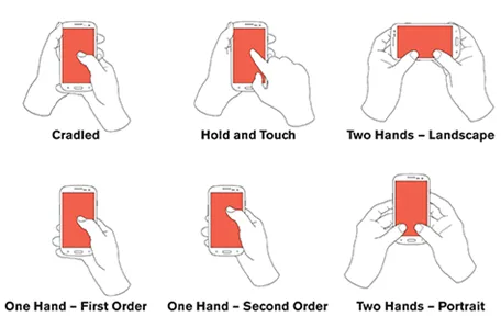
Important Elements Should be Within Reach
Everyone holds their phone differently, but it’s important to keep in mind that 75% of users use one-thumb interactions when handling their smartphones. That being said, designers must design for mobile in such a way that important features of an app or website are easily reachable by thumb.
create seamless user experiences and contribute to simplifying complex actions on mobile designs by taking advantage of the way people naturally interact with their environment (like when you push something you no longer want to look at aside).
Design with How Mobile Devices are Being Used Nowadays
Gestures like zooming, pinching, tapping, swiping, and so much more are common when using a mobile phone. Forget actually using an app – even navigating the mobile device’s user interface requires the use of these gestures.
It’s important that mobile design considers these gestures in order to maximize efficiency and provide a comfortable, familiar form of navigation to users who are already familiar with such motions. Specifically, designers should think about the goal of the site/app they are designing and align touch gestures to those goals for the most seamless experience.
Manage Asset Sizing
Pick up your phone and head on over to your favorite app. Now, focus on the different buttons, links, etc. Are they big enough to click on comfortably? Making sure the mobile app’s design assets are not only cohesive with the rest of the design but also a good size for user usage is important – if users can’t comfortably get to what they need to, what’s the point of having an app or website on mobile?
Does Its Presence Make Sense on Mobile?
One of the best navigational tools a website can have is its navigation bar – on its web version. On mobile, however, a traditional nav bar just doesn’t make sense. It’s bulky, takes up too much space, and can ruin the design on mobile.
To avoid a negative user experience, mobile developers and designers focus on identifying and adjusting assets that work beautifully on web versions of your design, but not so much on mobile.
Using the nav bar as an example, its replacement on mobile would be a hamburger menu – open it up and you’ll find the nav bar, but it should look way better on mobile and be easier to take in.
So, why do mobile app developers need to pay attention to touch gestures and touch-activated assets? They simultaneously save space, utilize natural mobile gestures, and make it easier for a user to navigate the site/app on mobile.
What is mobile UX? According to the Interaction Design Foundation, it’s “the design of positive experiences during the use of mobile devices and wearables, and applications or services running on such devices.”
Mobile users expect quick results, so designers need to make sure the mobile experience of a site or app is personalized, efficient and enjoyable. You can ensure such an experience by implementing everything we’ve already discussed, while also keeping the two points below in mind.
Improve Site Load Time
Connections on mobile are less reliable and mobile users are more impatient than ever. One of the best ways to keep attention on your site and reduce user frustration is to reduce the quality and/or resolution of the files on your site.
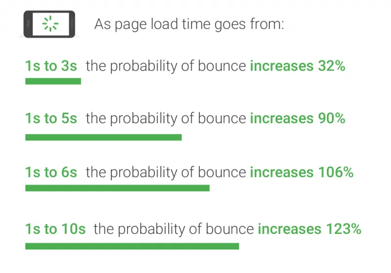
Having a large image or video on the desktop version of your site and having the same file on the mobile version as well, can really slow down the mobile load time and waste bandwidth. Make sure you’re delivering scaled images so that users can experience faster load times – especially since 53% of visits are abandoned if a mobile site takes more than 3 seconds to load.
The resolution of the image is the number of pixels stored in it – or its size. Image quality refers to the level of JPEG compression used when saving the image. The process converts and image’s pixels to a set of waves, and then removes waves that aren’t necessary to keeping the image’s integrity, based on their amplitudes. Making sure that an image is compressed is an easy fix to low loading speeds.
Sometimes, it’s recommended that videos deemed unnecessary to the overall user experience should be hidden or removed for the sake of speedy loading.
Linking Mobile Numbers and Addresses
Links and addresses on mobile are supposed to be easier to find. They should also be easy to interact with, especially considering mobile devices have access to thousands of apps that can best streamline the user experience and leave your users wanting more.
Responsive design refers to the idea that your site or app should display equally as well on any screen size – from widescreen monitors to mobile phone screens. Responsive design is also important in maximizing a positive user experience, so designers and developers shouldn’t ignore it.
Layout
Does the layout of your design make just as much sense on mobile as it does on a desktop? Have you considered what the design should look like in both landscape and portrait mode?
Creating a responsive layout grid with columns, gutters and margins can help tremendously with the task of making a site or app responsive. The key is defining these elements as percentages rather than fixed values, so that the content adjusts itself as screen size changes.
The same idea goes for the content itself. When building responsively, pay attention to how you are defining your content. For example, an image on the web with a 50% width would look too small on mobile if it keeps its 50% width.
Let’s not forget about breakpoints, which BrowserStack defines as ‘the ‘point’ at which a website’s content and design will adapt in a certain way in order to provide the best possible user experience.” Breakpoints will ensure that, while the website or app is acting flexibly, there are certain sizes where the layout will be forced to look exactly as the designer intends it to.
Check out web designer Zoe Mickley Gillenwater’s book, “ Flexible Web Design: Creating Liquid and Elastic Layouts with CSS” for more info on creating fluid websites.
Animations & JavaScript
Animations don’t always look the way you intended them to, so double check that everything is working well prior to making your site or app live. Similarly, JavaScript doesn’t always work on mobile. In that case, either remove the assets that require JavaScript, or try finding a workaround.
For more information on mobile app development in New York, software development in New York, web application development in New York and more, please feel free to reach out to us at CXR.Agency and we would be more than happy to assist. At CXR.Agency, we make sure to keep our pulse on all things software development and app development.
We are a mobile app development agency in New York that reimagines how people interact with brands. Our app developers disrupt the status quo and uncover values others can’t find. We solve tomorrow’s business challenges in thoughtful, elegant ways and aim to be strategic leaders in app development in New York – innovators in user experiences. Our mission is to arm businesses for digital revolution. Check out our mobile app development case studies at CXR.Agency for more information.